
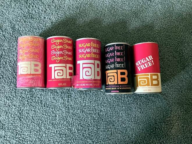
The designer behind the can that defined a generation of diet soda
The Can Everyone Remembers
Ask a TaB drinker to close their eyes and picture the soda can, and they won’t describe a logo. They’ll describe a color, a flash of electric pink that didn’t just sit on a shelf. It caught your eye before anything else could.
Decades later, it still shows up on T-shirts, in basements turned into TaB shrines, in pantries where the cans are stacked like tiny trophies. Most people don’t know the pink wasn’t TaB’s first look, and almost nobody knows the name of the man who made it so. We tracked him down: packaging designer Knut (kuh-NOOT) Simonson. What we found was the quiet truth behind an icon, a chemistry problem, a deadline, and one designer’s plain, practical answer to both.
Meet the Designer
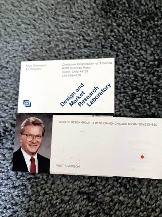
Knut Simonson’s business cards from Container Corporation of America and Dickens Design Group, including his employee photo from the era.
Knut joined Dickens Design Group, a small Chicago firm, around 1969, after art school in Milwaukee and a couple of years at Container Corporation of America. He wasn’t chasing fame. “I was a problem solver,” he said of his own approach. “…I would evaluate it and look at it as solving the problem, to make it sell more product.” Sometime around 1970, TaB landed on his desk.
A Chemistry Problem Becomes a Design Problem
TaB’s original formula relied on cyclamate as its sugar substitute. When cyclamate was banned in 1969, Coca-Cola’s first fix was a blend of saccharin and real sugar, not saccharin alone, and TaB briefly shipped in a can that said so plainly: “Sugar Added, No Cyclamates.” That didn’t last. Once Coca-Cola settled on saccharin alone, the can needed to say something very different, and just as urgent: TaB was sugar-free again, and it needed to say so clearly, at a glance.
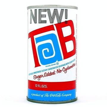
TaB’s short-lived interim can, reformulated with real sugar before saccharin took over for good.
“So I came up with a pink can,” Knut told us. “I repeated the word sugar free… in a script above the word TaB. That was the original design.” His first version repeated it four times. Production trimmed it to three. There was no design software, just a pencil sketch, a marker rendering, and a hand-built mock-up before anything went to print.
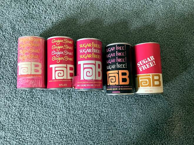
Knut’s design mockups, including the can at center that went into production.
Why Pink?
The pink wasn’t new. It was already there. “One of the three letters was pink… from the original design,” Knut explained. “TaB was a pink and blue logo. I left off the blue, so I used the pink from the original…” He didn’t reinvent TaB’s identity. He distilled it, keeping the one color that mattered and letting it speak louder. That pink carried through every redesign that followed, all the way to the end. It became the brand.
A Legacy He Still Notices
TaB’s pink cans still turn up in movies and shows set in the ’70s and ’80s, doing work a set designer doesn’t have to explain. Knut notices every time. “I have to admit, if I see that, I always notice it,” he said. “…Nobody knows who I am or who did it, so it doesn’t make me different. But I don’t mind. It is kind of a neat thing to see happen. It became a nice compliment, I guess you’d say.”
Asked how he’d sum up the impact of his work all these years later, he didn’t reach for the pink can. He reached for something bigger: “I was very proud of it,” he said. “I was just proud of what I had accomplished, coming from a small town in Wisconsin, with very little education compared to most people, four years of art school. I’ve accomplished a lot.”
A Message for Coca-Cola
We asked Knut directly: if he could say one thing to Coca-Cola about TaB today, what would it be? Should they bring it back?
“I would like to see them bring it back,” he said, “because I think there [are] a lot of people that liked it. It’s still a good product that people do like…[and they] would continue to buy it if it was available.”
The man who designed the can TaB fans still love, more than fifty years later, agrees with every single one of them: bring it back.
Read the full article on our site at: The Origin Story of TaB’s Pink Can, Knut Simonson, Save TaB Soda
 Save TaB Soda
Nice
>
LikeLike